
The Rules of Light In Interior Design: They Matter Way More Than You Think

Why We're Drawn To Light
Before I ever specified a light fixture, I spent nearly a decade working in the STEM field with a B.S. in Biology. So when I say light is the single most powerful tool we have in this profession, I am not speaking as someone who picked that up from a mood board. I am speaking as someone who spent years thinking analytically about how living things respond to their environment before I ever set foot in a design studio. That background never left me. If anything, it is what drew me to design in the first place, and it shapes the methodical, sustainability-minded way I approach every project now.
In the built environment, the majority of our experiences are visual. Light can quickly and powerfully alter the appearance and emotional effect of a designed space, faster than layout, material, or finish ever could.
A designer can spend any amount of time refining the scale of a room, the materials, the finishes, but the lighting can supersede all of it in an instant. Picture a meditation room: calming colors, natural materials, no ornamentation. Now light it with a red strobe and a disco ball. The meditative effect disappears immediately, even though nothing else in the room changed. Lighting can be applied to enhance or destroy the desired effect of a space just that easily.
Part of why light has this much power over us is that our attraction to it is instinctual, not a matter of taste, trend, or personal bias the way most design choices are. In botany, there is a term for this: phototropism, from the Greek meaning roughly "light-attracted." It describes the way a plant physically bends and grows toward a light source, not out of preference, but survival. Humans carry a version of that same pull. Our ancestors needed daylight to hunt, forage, and stay alert to danger, and that instinct never left us. As designers, we can use it deliberately: place light at the end of a hallway or at an entrance, and people will gravitate toward it without ever consciously registering why.
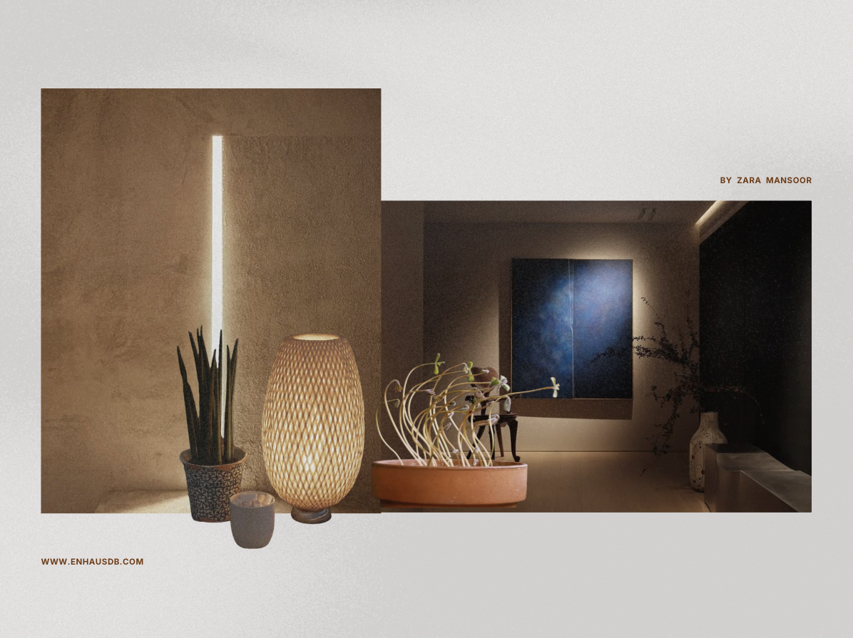
Three basic properties of light
Once you accept that light is doing real psychological work in a space, the next step is understanding what you're actually controlling. Every light source, no matter how simple or sophisticated, can be described along three basic properties.
01. Intensity: bright vs. dark
Higher light levels stimulate activity and movement. Lower light situations often encourage lingering and relaxing. This is intuitive once you notice it: a dim room invites people to stay, a bright room invites people to move through.
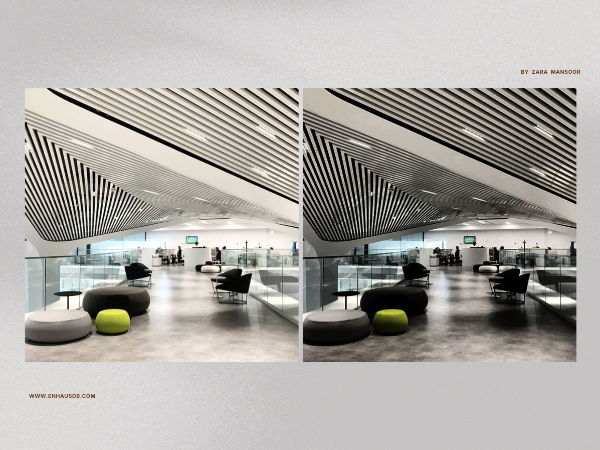
02. Color: warm vs. cool
Warm lighting evokes calm. Cool lighting evokes awareness. Saturated, unusual colors evoke unique experiences, which is exactly why you see them in theme parks and holiday displays rather than everyday spaces.
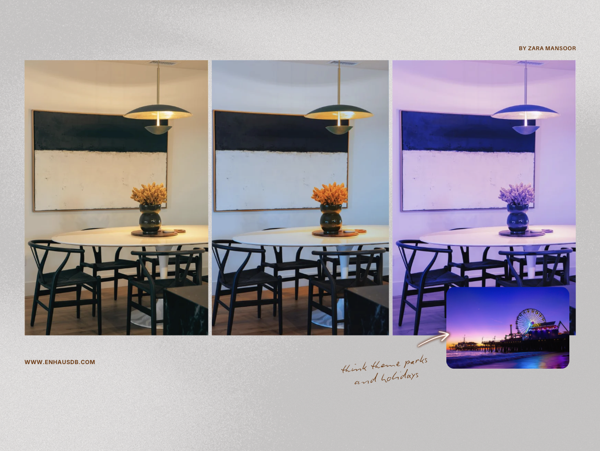
03. Texture: diffuse vs. directional
Diffused light reduces shadows and encourages long-term visual comfort, the kind you want in a room people will sit in for hours. Directional light creates dramatic contrast instead. I love directional light for showcasing art or an architectural feature. It is the property most people never think about, and the one that does the most to reveal what's actually interesting in a room.
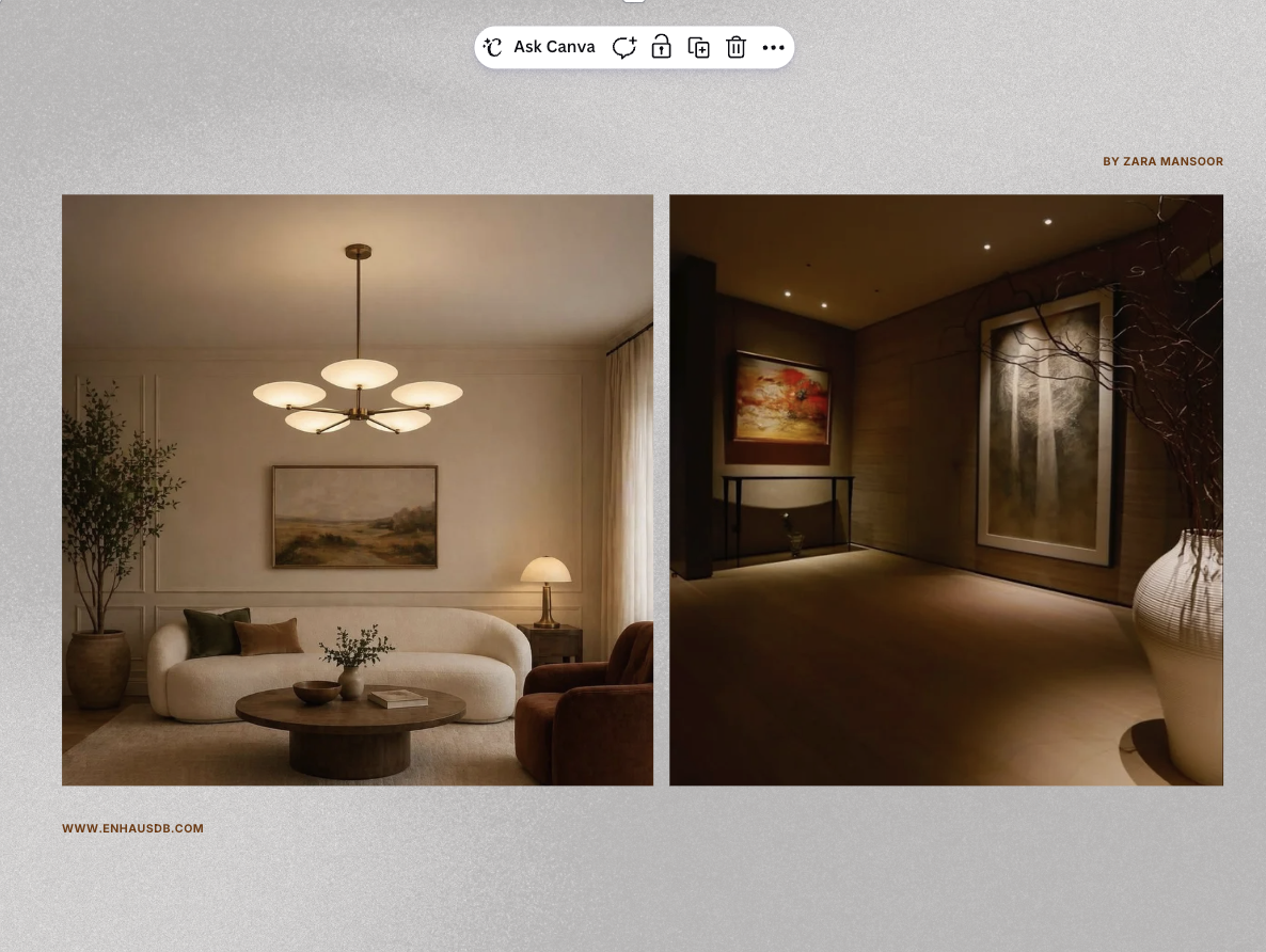
Building a space in layers
One idea that changed how I approach every project is lighting in layers. Instead of treating light as one decision, I treat it as five stacked on top of each other.
- Choreography. Using lighted end points, walls, art, or furniture to direct how people move through a space, the same instinctual pull described above.
- Mood and ambience. I build a mood map for every project, labeling each room with the emotional tone we're after, cozy, dramatic, energizing, and translating that into intensity, color, and texture decisions.
- Accenting objects. Applying light specifically to make already-interesting things more noticeable, whether that's directional light revealing a sculpture's texture, or even, abundant side light on a bakery case.
- Revealing architecture. Highlighting the forms and details already designed into a space, an arch, a brick wall, a change in ceiling height, with real thought given to where the light appears to originate from.
- Task lighting. The light that exists purely so people can read, cook, or navigate safely. Critical, but never meant to carry a room alone.
The mistake I see most often is skipping straight to layer five and stopping there. A room with excellent task lighting and nothing else always feels flat, because none of the emotional work has been done.
The science behind color: CRI and color temperature
This is the part of my biology brain that gets genuinely excited, because it's measurable science, not just aesthetic intuition.
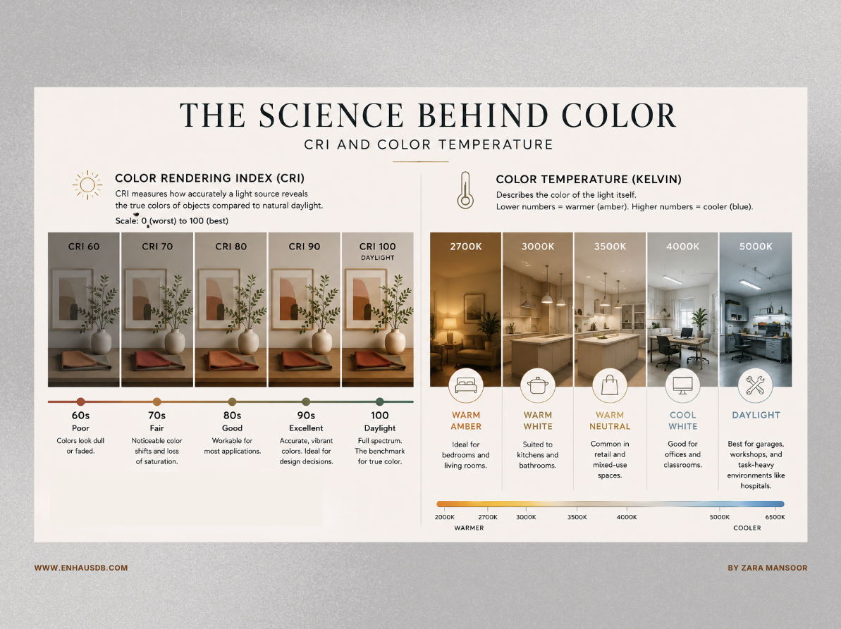
Color Rendering Index, or CRI, describes how complete a light source's spectral output is, on a scale from 0 to 100. A source with a CRI of 100, like daylight, emits the full visible spectrum, so materials in the room reflect back their true color. A low CRI source is missing chunks of that spectrum, which means colors look duller or shift entirely. This is why two paint swatches that look identical under one light source can look completely different under another. CRI in the 60s and 70s is not acceptable for making real color decisions. The 80s are workable. The 90s are what you want anywhere color accuracy actually matters.
Color temperature describes the color of the light source itself, measured in kelvins. Roughly:
- 2700K reads warm and amber, ideal for bedrooms and living rooms
- 3000K is a warm white, suited to kitchens and bathrooms
- 3500K is a warm-neutral, common in retail and mixed-use spaces
- 4000K is a cool white, good for offices and classrooms
- 5000K mimics daylight, best for garages, workshops, and task-heavy environments like hospitals
CRI generally matters more than color temperature. A light source that renders color accurately can lean warm or cool and still do its job well, the way natural daylight shifts dramatically from sunrise to sunset and still reveals true color all day. But a source with poor CRI renders color badly no matter what temperature it is. Low pressure sodium streetlights are a good example: warm in temperature, extremely low in CRI, fine for a sidewalk, wrong for a home.
Designing with daylight
I'd be doing this topic a disservice if I didn't spend real time on daylight, because it's the original light source and it still deserves top billing in any design.
Daylight costs nothing to run, needs no maintenance, and connects us to the natural world in a way electric light can't replicate. There's real evidence that daylight exposure affects mood, supports vitamin D synthesis, and lifts energy levels. It's also dynamic in a way electric light rarely is, which is part of why so much lighting technology tries to mimic the gradual shifts of a natural day.
Daylight serves two functions in a project. Functional daylight provides diffuse, even illumination for everyday tasks and comfort. Daylight accenting is more dramatic, used deliberately to create visual interest and emotional impact in high-design spaces.
When we're actually designing windows and skylights, a few physical realities shape every decision:
- Latitude determines how high the sun sits in the sky throughout the year
- Cardinal orientation determines when a space gets direct sun exposure, since the sun rises in the east and sets in the west
- Seasonal sun angles shift high in summer and low in winter, which is why a well-designed overhang can block harsh summer sun while still letting in low winter light
- North versus south orientation, in the northern hemisphere, means south-facing rooms get direct sunlight throughout the day, while north-facing rooms receive only indirect skylight, which reads noticeably cooler
Getting the numbers right
Eventually, intuition needs to meet math. Lumens measure the total visible light output of a source, and they're what actually determines brightness, not wattage, which only measures energy consumption. There are two ways to calculate how much light a space needs. The lumen method determines how many fixtures you need to hit a target average illumination across a room. The point calculation method determines exactly how much light lands on one specific target from one specific source.
For a general residential starting point, here's what I typically reference:
Room
Recommended lumens per sq. ft.
- Living Room = 10 to 20
- Bedrooms = 10 to 20
- Kitchens = 30 to 40 ambient, 70 to 80 in task areas
- Bathrooms = 30 to 40
- Home Offices = 40 to 50
- Hallways= 5 to 20
These are starting points, not rules. Every space still deserves the layered thinking above.
Why this matters for your rebuild or renovation
Whether we're rebuilding a home lost in the Eaton Fire or bringing new life into a historic Pasadena house, lighting is never an afterthought on our projects. It's one of the first conversations we have, because it touches every other decision that follows: materials, layout, mood, function. I studied biology because I wanted to understand how living things respond to their environment. It turns out that's exactly the question good lighting design is trying to answer for the people who will actually live in the space.
If you're planning a rebuild or renovation and want to talk through how light could shape your home, reach out to us at Enhaus Design Build. This is genuinely one of my favorite parts of the process, and I'd love to walk through it with you.
Much of the science and terminology referenced here draws on Sage Russell's The Architecture of Light, Second Edition*, one of my favorite references in the field and a book I return to constantly.*
About the author: Zara Mansour is a designer at Enhaus Design Build. She holds a B.S. in Biology and a CIDA-accredited certificate in Interior Design, and spent nearly a decade in the STEM field before pivoting into architecture and design. She previously served on the board of the ASID student chapter at UCLA Extension, helping connect emerging design students with the professional community. At Enhaus, she supports the design team on creative concepts, project development, and cross-departmental collaboration, bringing an analytical, sustainability-minded lens to every project.